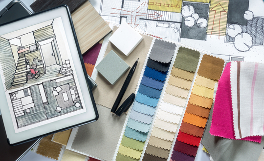
If you’re working with interior design clients who want to keep things simple without being too bland, there are a few tricks you can try when it comes to selecting a color palette. Many clients are turned off by the idea of a beige look because it seems uninteresting and dull.
For starters, it might be worth explaining to them that there are a variety of shades in the beige family that are much more visually appealing than the classic color they might be envisioning.
However, in the spirit of bringing more interesting suggestions to the table, if you’d rather avoid suggesting beige altogether, there are a handful of unexpected neutrals that are equally versatile when it comes to simple design.
- Purple
Purple might seem like an unexpected suggestion in terms of neutrals and simplicity, but if you select a shade that has a fair amount of gray or brown mixed into it, those will work as neutralizers, and will greatly soften the purple look.
If your clients are interested in experimenting with some purple, start by suggesting a lavender or a warm shade of mauve - these are both gentler, more natural looking hues that provide just a subtle hint of color.
- Blue-Gray
Blue-grey is an incredibly common pick when it comes to neutral with a twist. This is an especially practical choice if you’re working on a master bedroom redesign. Not only does this color family bring a very soothing, relaxing energy to any space, it’s also very easy to mix and match with colorful accents.
- Gray-Green
Again, if you choose any one of your client’s favorite colors but opt for a shade that has the right amount of grey or brown mixed in, you’re left with a more subtle version of that color, which can then be easily used as your neutral base.
This gray-green look has the same soothing effect we mentioned above, and is a popular pick for bathroom designs because of the earthy, spa-like effect it adds to a space.
- Gold
While chartreuse seems to be one of the new “it” colors for interior designers of late, this shade is a little too bold to work as a neutral. However, if you start at chartreuse and work back a few shades lighter, you’re left with a soft-looking golden yellow that could easily play the role of a room’s base neutral.
- Warm Gray
Many clients avoid the idea of grey because they fear it gives the home too much of a chilly, wintertime look. If you opt for the more traditional grey shades this may be true, but if you browse warmer options you’ll be pleasantly surprised with the flexibility the shade offers in terms of a neutral. Warm grey has a very crisp, clean look to it, and is a great option to suggest to clients with more minimalist taste.
Making Decisions About Color
Choosing a color palette can be a daunting first step when it comes to diving into a design project. If you’re unfamiliar with industry-standard color and design theory, this can make the decision all the more challenging.
In Lesson 1.3 of the New York Institute of Art and Design’s online Interior Design Course, you can spend the entire lesson focusing exclusively on professional color theory. You will start with the basics, like an introduction to the color wheel and the primary, secondary and tertiary hues.
From there, you will learn how to mix primary hues to produce secondary and intermediate hues, at which point you can begin to think about how to use color in your design. If this course sounds like the right fit for you, feel free to call 1-800-583-1742 for more information, or click here to learn more.


