
From end tables to throw pillows to paint samples and more, tune in to the design blog every Tuesday afternoon to check out our choice for NYIAD’s featured look of the week.
This week’s favorite comes to us from Greenbox.
Every object in a room has a certain weight to it- and we’re not talking about how heavy it is. When it comes to balanced interior design, bright colors are visually heavy, while neutrals are much lighter.
Vibrant home décor is a popular choice for many designers- it adds visual appeal and character to a room, helping to display more of a client’s personality. But other than contributing to charm, colorful decorative choices can also be extremely helpful in a more calculated way.
If we gave a designer two couches of the same exact model, they would then need to analyze the color of their upholstery in order to determine which one would fit more appropriately in a given room. A taupe couch, for example, ‘weighs less’ than its cherry-colored twin, and might be more fitting to include in a small studio apartment.
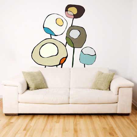
This week’s #LOTWDesign effectively demonstrates a stylist’s ability to create harmonious balance in respect to these colorful considerations.
Although the floor space in this room is relatively small, the décor placement supplements this reality with a careful balance of weighted color. Placing a ‘lighter’ neutral couch on the ground while displaying a ‘heavy’ decal embellishment on the wall balances the room, creating more spatial coherence and overall accord.
Got an eye for great style trends we should consider? Share your favorites with us on Twitter and Instagram using hashtag #LOTWDesign.
Want to learn more? The New York Institute of Art and Design’s interior design course can help you reach your goals. Request your free course catalog today!


