As an interior designer, tapping into trendy color palettes can be tricky. Incorporating the "it" color of the moment makes your designs feel fresh and current. Yet, most clients can't afford to reinvent the wheel every time color trends change, so you don't want to depend solely on the hot color of the day, either. How do you strike a balance between trendy and timeless? Imagine a highway with two lanes going in each direction — a slow lane with neutrals in it, and a fast lane, with accent colors weaving in and out of fashion.
Slow Lane Colors
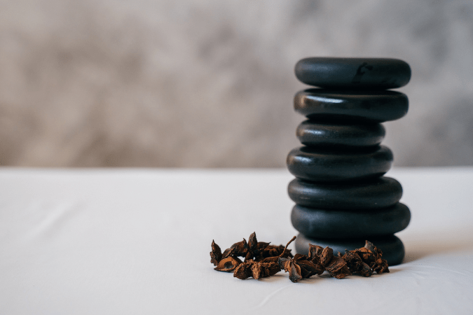
1. Long-term trends. Slow lane colors can remain fashionable for as long as ten years or more. Wood tones are a great example of slow lane color. Things like kitchen cabinetry and flooring tend to last a long time and cost a lot to replace, so there's not as much turnover on the market where preferred colors are concerned. Likewise, you'll notice a similar slow-to-change cycle with paint, tile, and carpet colors selected for model homes.
2. Watch for the tipping point to predict a trend's end. Let's use espresso wood tones as an example, which came on the scene roughly ten years ago and is slowly on its way out. At first, people were slow to adopt such a dark color, but after seeing more and more furniture and kitchen cabinets in espresso finishes, the idea became less shocking, and the tone became increasingly popular. Customers started requesting products in this color with greater frequency, and manufacturers increased their espresso-toned furniture, flooring and cabinetry offerings to meet the demand of the market. After several years, it seemed like everyone and their brother had an "expresso" this or a wenge that. Once the wood tone became ubiquitous, early adopters equated this color with being "average" and started rebelling against it. Since early adopters (EAs) drive future trends, you can be certain that a new trend is on the horizon once EAs become bored with a slow lane color. When I noticed that the majority of new clients had already gone espresso-crazy in their homes, I started pulling back on recommending that wood tone for new builds and remodeling projects.
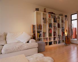
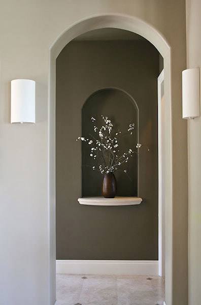
3. It pays to be ambiguous with overall color. Looking back in recent decorating history again, you might remember a time when every new home on the market featured paint and carpet in some shade of "builder beige." That lasted for what seemed like a hundred years, but now the slow lane color is trending toward grays, so you're seeing home furnishing catalogs and model homes featuring gray walls, driftwood colored wood floors, and gray carpeting. If you can buck the trend and choose a color scheme that is perhaps between beige and gray (or "greige," as some designers refer to it), your projects won't feel as trend-dependent.
Fast Lane Colors
Accent colors in the fast lane are literally passing fads and only feel current for a couple of years.
1. Be strategic with paint palettes. In the age of the great room and the proliferation of two-story entries and living rooms, it is getting more difficult and costlier to repaint your interiors. Keeping the majority of the paint in these rooms neutral gives your clients more latitude to change their accent colors periodically without breaking the bank. If you're working on a room that is smaller or more closed off, you can get a little more experimental with paint color because it's easier to change later on down the road. Powder rooms are particularly great for bold, trendy color, due to their small size. Since you don't typically have a lot of textiles and furnishings in a powder room, a new paint color doesn't necessitate a thousand other expensive changes like a paint update in a living room might.
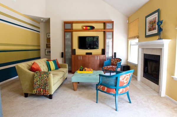
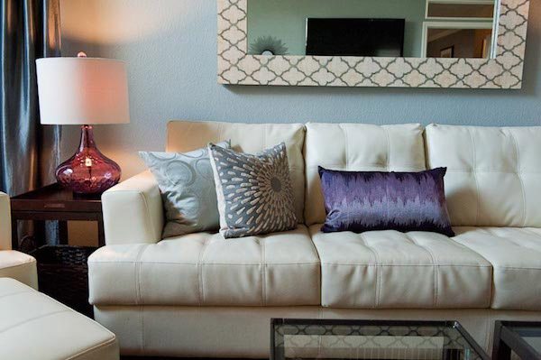
2. Mo' money, mo' problems. The higher ticket the item, the more "safe" it should be in terms of color. Your clients don't want to drop $2,000 on a sofa every three years, and they sure don't want to rip out their new backsplash tile anytime soon, either. These are the places where it makes sense to go neutral and stay in the slow lane, or to use color minimally. Be bold with trendy color in your accessories, pillows, and throws. They are less costly to swap out later.
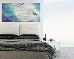
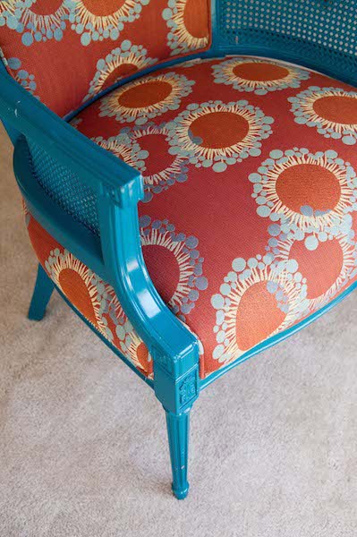
3. Making trendy timeless. Right now, teal and gold are everyone's BFF. You can't walk into any home décor establishment without finding dozens of rugs, curtain panels, table lamps, and pillow covers in this color combination. You can prevent the rooms you've designed in this palette from needing tweaking in two years if you throw an off-trend color into the mix now. Featuring a striking compliment like magenta or brick red along with on-trend teal and gold makes your space feel less like it's date-stamped with "2013" down the road.
4. Exceptions. There are exceptions to every rule. There's no need to stick to neutrals in a bathroom's design just because you're going for a timeless look. Virtually any shade of blue (trendy or not) works in a bathroom because of the way the color evokes water. Hall bathrooms can feature more playful hues because it's assumed they will be used by kids. If you're mindful of these concepts while you're creating a design plan for your clients, you can help them make wise investments where color is concerned.
Bonus: Want to learn professional interior design skills? Enroll in the New York Institute of Art and Design's Interior Design Course today!


